Today, the global trend for a business is to go online. Practically, if you are not online, you do not exist. However, there are so many retailers and businesses online that it is not enough to just have a website. The website should have a customized user-friendly design, easy-to-use interface, quick and easy checkout, simple registration, and demonstrate enough perks to engage customers in the long-term relationship with the online store.
Go Online with BigCommerce
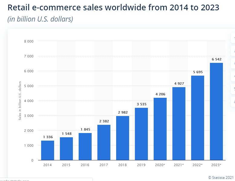
Numerically, online retail is growing rapidly, and the pace of growth is not going to slow down any time soon. According to Statista, e-commerce retail is growing rapidly and is expected to reach a stunning $6,542 billion by 2023, which is evident from the picture below. There is no doubt you would wish for your business to grow with the market, so join a handful of successful online BigCommerce websites with our help.
Anyways, it is not easy to build a website that attracts millions of visitors and works perfectly great. Therefore, a great idea is to use the platform designed to develop online retail stores from scratch quickly and easily. One of the best platforms to stick to is BigCommerce. The BigCommerce platform provides enough features and opportunities to build an online store with a nicely working e-commerce platform and a range of supporting plugins that are going to extend functionality as necessary for your business. It is important that you get the opportunity to pay only for the features you are going to use, without the need to pay more. Though, designing the online store requires considerable skills and efforts, but might be done individually or completed with the professional help of one of the best BigCommerce developers.
Build a Successful Online Store
However, when building your own online store, make sure that the project conforms to the functional requirements, which is important to boost your store’s productivity and business efficiency.
Make sure your website looks appealing to the chosen local market
One of the most important groups of functional requirements is the need to fit in the cultural expectations of buyers. For example, people from the US and people from Europe are going to be slightly different in their expectations but the difference between Americans’ and Arabs’ online shopping patterns and preferences is going to be huge. Technically speaking, UX specifications should be different for different regions or particular site targets. If you plan to make your store international, there is a need to think about localization. Just one example: English-speaking people are going to look at the page from top left to down right while Arabs will look at the page from the top right to bottom left, and the design should be different to these cultural groups.
Make sure you have thought about return and refund policies
It is important to remember that when you plan to work with American customers, you need to be ready to ensure quick and easy return and refund policies. American consumers are perhaps the most sophisticated consumers in the world as soon as they are used to quick returns and smiley refunds. As soon as the entire American economy is famous for its prevailing delectable consumerism, American customers are going to be ready to pay for the service or the product but they might return it if they don’t find it necessary or working as expected. To make sure your refund and return policies work smoothly, you will need to create an online form for refunds and returns, making sure that the form and the process of return and refund meet the requirements of the legislation of the country or the state.
Make sure your online store is easy to navigate
All commercial websites need to feature easy navigation so that the customers can quickly find the item they need. Moreover, for online retailers, a full shopping cart does not necessarily mean that the consumer is going to make a buy. As a result, the process of checkout should be as smooth and quick as possible so that the customer has no reason to abandon the items in the cart without purchasing them. This is especially important for online retailers with a huge variety of goods or healthcare commercial websites that need to make sure the customer finds the item in a few clicks, still selecting it from the huge range of products. Such kind of usability is the main feature of legendary iHerb. At this point, logically structured directories and mega menus are going to be handy to ensure the user-friendly design and smooth working of the website.
Think about Functional Requirements
Usually, functional requirements are grouped into two major groups, such as the first category and the second category. This divide is necessary to simplify the process of leading the consumer to a successful purchase. Specifically, the first category of functional requirements includes the development of search options, sorting, filtering, navigation, and design localizations as discussed above. The second category includes the interaction with a cart, return and refund forms, promotional campaigns and discounts, social media promotion, and other things that impact the way that consumers interact with the website.
Document the Spec for the Project
Ideally, when thinking about building a website, you are going to have the scope of the project in your mind, as well as the timeline and the budget for the website. Therefore, it is necessary to design the spec document that showcases the most important requirements to the online store. When writing the spec, always put your highest priority first. For example, start with minimizing the steps to make a purchase.
Minimize the steps to make a purchase
When preparing the spec, make sure to minimize the steps that the consumer needs to make to purchase a necessary item. Also, make sure that the checkout process is simple and quick. If you were not planning to allow purchases to non-registered users, think twice. The need to register makes the checkout process longer and more complicated, thus reducing the number of successful purchases. Finally, point out in your spec that the icon of the shopping cart should be easily visible on any page, thus enabling the user to interact with the cart easily, checking the added products, adding ones, etc.
Make your online store mobile-friendly
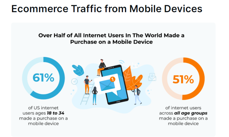
When writing the spec, think about making your store mobile-friendly. Such a move is going to boost the number of purchases from your website. Specifically, consider mobile-first design as soon as more people make purchases from their mobile devices than ever before. Specifically, 61% of all adults aged 18 to 34 make purchases online using their mobile devices.
Create meaningful design and content
When developing your BigCommerce website, make sure to devote enough time and attention to designing the website and writing useful content. While for any online store, content needs to be meaningful, clear, and useful, which means there is a need to invest in writing, the things are not that simple for the design. There is always a choice of whether to go with the custom theme or design the own one. The rule of thumb is you need your own customized design if you have your own models to have unique photo and video content. If you don’t, purchasing a ready theme might be a more effective solution.
Devote attention to the interaction tools
Make sure your email takes work fine and you are able to reach your customers with targeted emails and promotional campaigns. Importantly, make sure that the chosen tool is able to gather stats of how many users read the email and how many followed the link, and be prepared to have a blacklist to add those customers who refused to be emailed. Another important tool to make a connection is social networking. Thus, make sure to connect to the API of the most popular social media to stay connected with your customers.
Integrate payment and shipment systems
The more convenient the system is for the customers, the more likely they are going to purchase the products from the website. Most often, those systems that are familiar to the customers, are going to be that final drive that is going to initiate the decision to make a purchase. With familiar payment and shipment systems that the customers put trust in, and might have certain bonuses or personal discounts, customers are more likely to purchase the products. As soon as they trust the shipment and payment services, they are not going to hesitate to pay for the services or order products using your website.
Add filters and live chat
When writing the spec for your website, make sure to include handy filters that are easy to use and a live chat. Most often, the purchase is not finalized because customers cannot find the products they are looking for, for a long time. Often, the design of the website or structure of categories interferes with the ability of customers to quickly locate the item that they search for. At this point, make sure your categories are logical and easy to understand and add a live chat to your website so that the customers have someone to ask for help to find the item that they need.
Successful BigCommerce Websites
As already discussed above, BigCommerce websites might become very successful business projects. The main thing is to focus on the scope and structure of the website, keeping the design unique and pertaining to the main goal of the website. Below, we are going to list several very successful websites built on the basis of BigCommerce so that you might see the design and structure that works for customers very well. To introduce the websites effectively, successful projects are listed below with pics of their home pages and pages of categories. As soon as both these pages are important to attract customers, seeing the most successful examples might be helpful to decide on the structure and design for ones for your website.
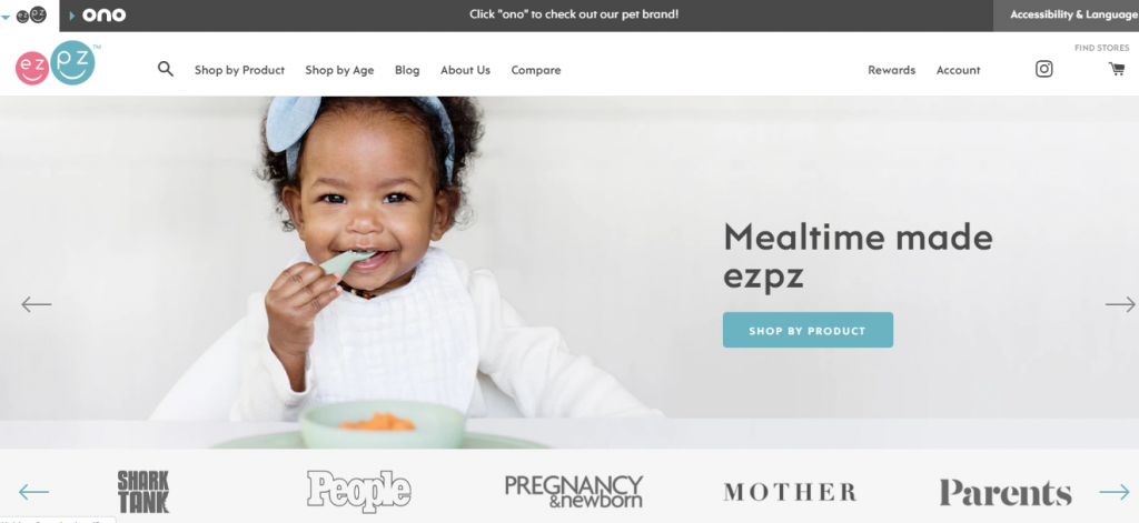
EZPZ placemats and plates for kids
The website cells plates and placemats for kids, featuring a bright design.
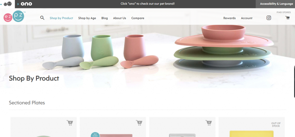
The page to choose categories is simple and stylish, with a short category menu on the top of the page and the option to shop for a certain product:
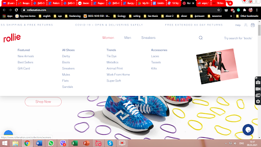
Rollie comfy travel shoes
The website sells comfy travel shoes and is designed to make their shoes look attractive for youngsters, apparently.
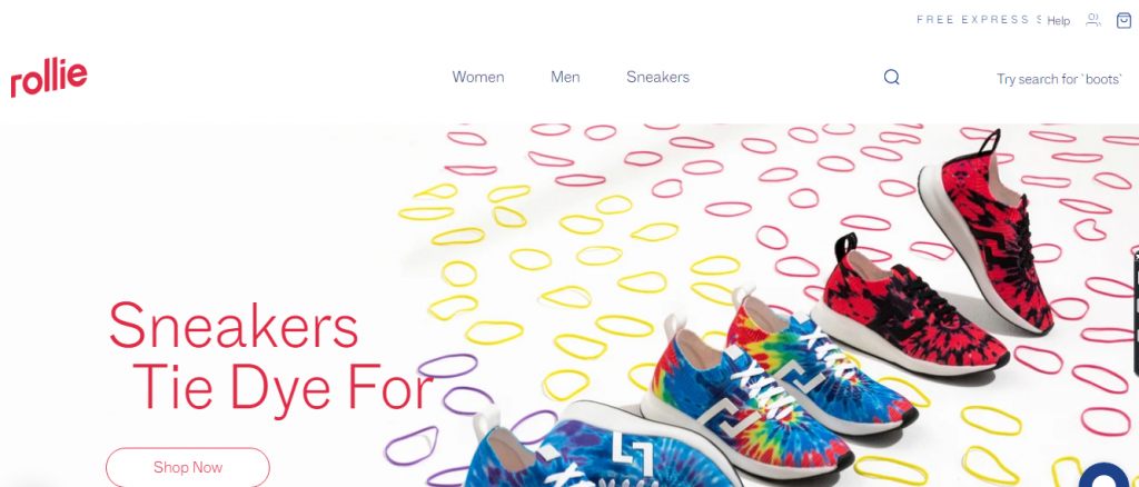
Product categories are located at the top of the page, prompting the customers to select between shoes for men, women, and sneakers.
Natori - a website selling luxury lingerie and bras
The brand offers luxury items, so their website uses a stylish pastel design, hinting at the high-end products and the high status of the brand.
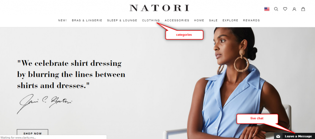
The online store has the option of the live chat at the right bottom of the page and shows the categories of products at the top of the page.
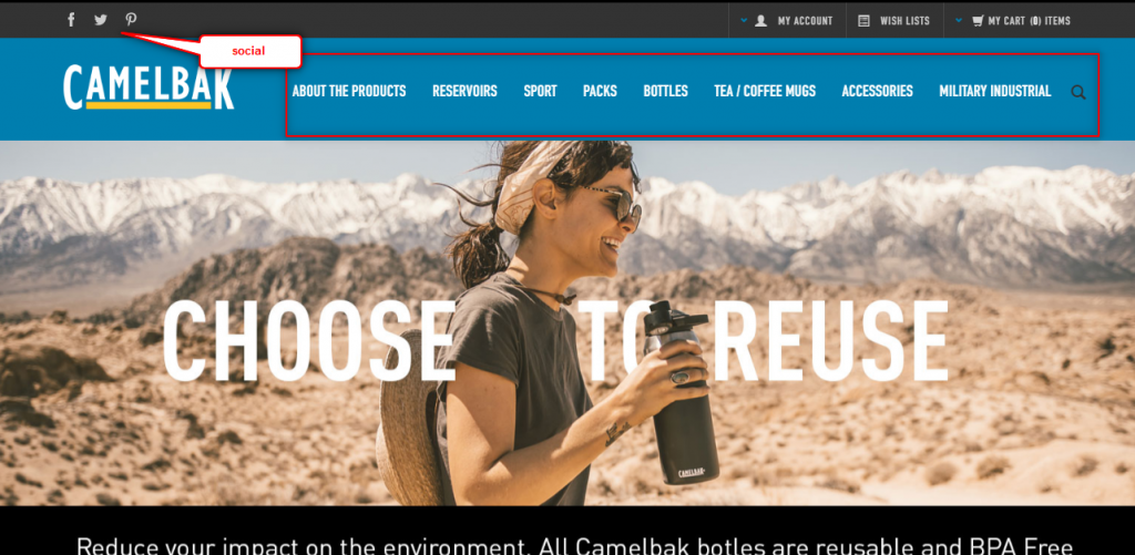
Camelbak - sells accessories for water carrying and drinking
The store is focused on selling various water bottles in a variety of designs and sizes as well as mugs and packs to carry all of them. As soon as the website sells its products to tourists or the military, the website is designed to promote the stuff to people who live an active life. The website is very clear and quick to navigate, which increases the chance for the purchase by minimizing the time that the customer searches for the necessary item.
Legendary Pandora
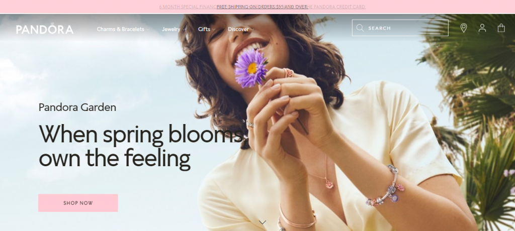
Pandora is a brand of jewelry that is well-known for its bracelets with charms and other peculiar things. As soon as the customers are more or less aware of the products they want to buy, and they need to take a look at others, the website needs to be beautifully designed to ensure the customers enjoy the experience and spend more time on the website.
Categories are mostly hidden and drop down when the customer moves the cursor on them:
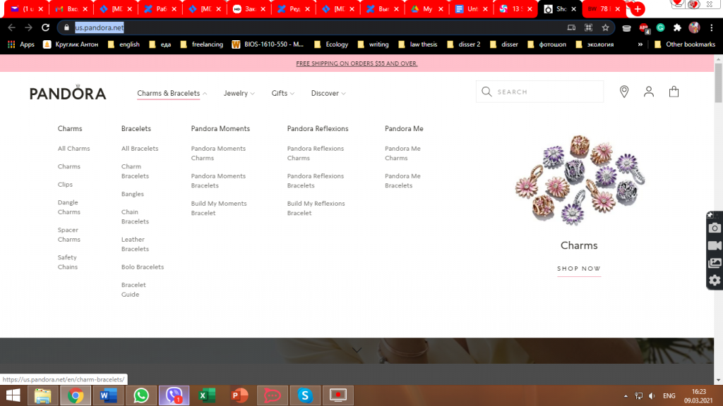
Interestingly, the names for products are selected in a way to intrigue the customer to know more about the item and go see the item on the website.
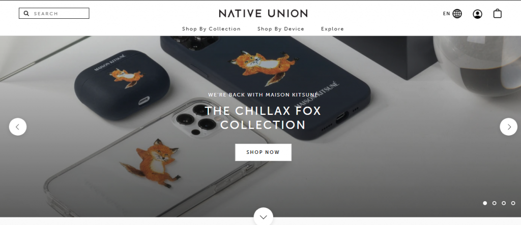
Native Union - reimagining accessories
The online store that sells luxury cases for mobile devices features the newest collection first on its home page. The company makes its store stand out as a luxury brand that offers individuality and uniqueness more than anything else.
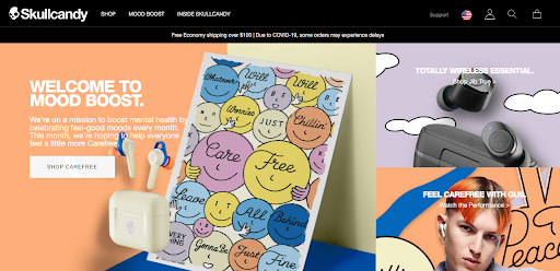
SkullCandy - reinventing the approach to earbuds and headphones
The website got the 2018 BigCommerce Best Category award and became the Product Page Design Award winner for the stylized product pages and product descriptions.
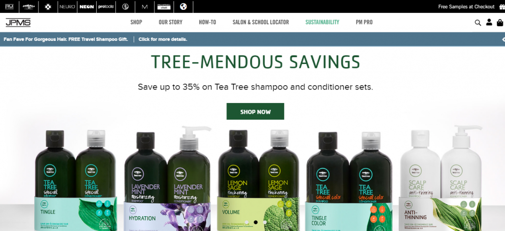
Paul Mitchell - luxury hair and beauty company
The online store specializes in selling luxury hair and beauty items. Design is pretty laconic, drawing the customers’ attention to the products, not the design or any other features. The menu is simple and navigation is easy to notice. Thus, customers might quickly locate the product they need to make their purchase in no time.
Clark’s - Australian brand shop
The online store is focused on the single-brand but it offers multiple options to pay for the purchase, which means more flexibility to customers and enhances successful purchases.
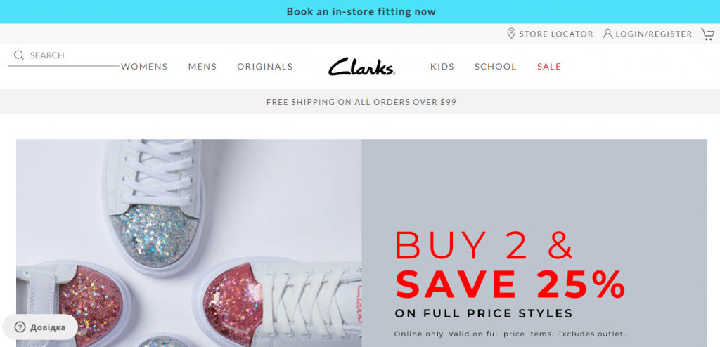
As far as we can see, the website showcases their discounts and the feature of trying the shoes on in-store before purchase.
Badgley Mischka - promoting fashion
The website sells branded items and makes the customers feel classy with their high-fashion design and emphasis on stylish clothes.
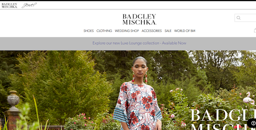
Traditionally, navigation is on top of the page.
Essential Label - selling all kinds of clothes, footwear, and accessories
The store sells clothes and accessories and features a very simple yet memorable design.
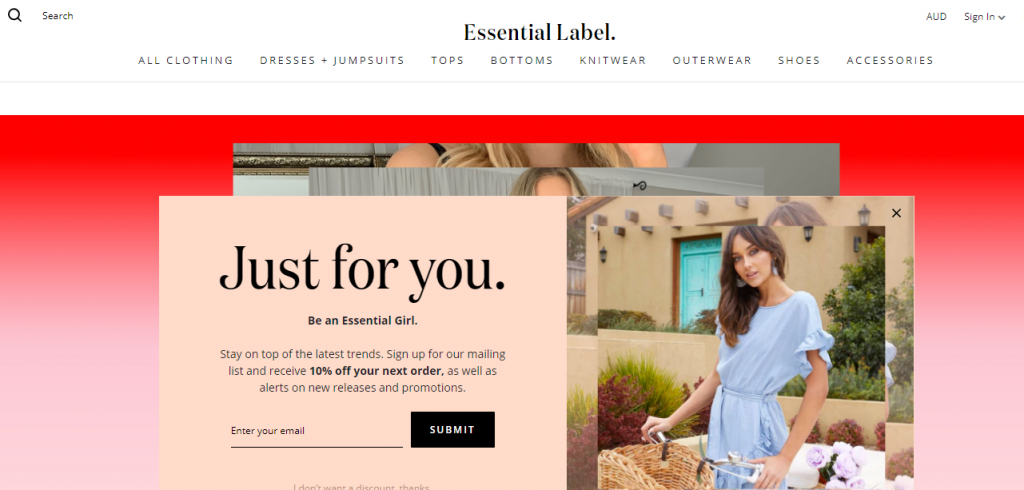
The main thing that the website promotes is the eye-catching prompt to sign up to get 10% off. That’s a nice idea to gather contact information about potential customers.
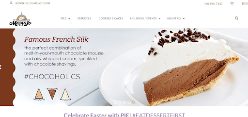
Mama Jo Homestyle Pies - yummy pies on white
The website sells pies, making great use of the whitespace design. The main selling idea is yummy pictures and the ability to choose the date for a pie to be ready right at the product page, which eliminates one step in the checkout process and engages the customer to complete the purchase.
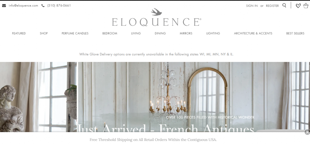
Eloquence - luxury interior items
One more stylish use of the whitespace, this time for selling interior items.
Bohemian Traders - clothing retailer based on fun
The retailer offers to buy clothes and accessories with fun, which means having lots of pics and other content that makes the website interesting to visit. Thus, the process of buying clothes online gets really exciting and a new customer is turned into a returning customer.
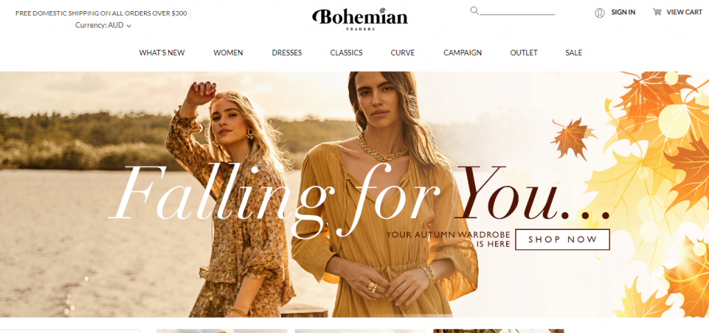
Navigation is pretty standard but clear and understandable, which is a great advantage.
Decibullz - seller of ear-protection apparel and music accessories
The seller specializes in earphones, earbuds, and other accessories that play music and/or protect ears.
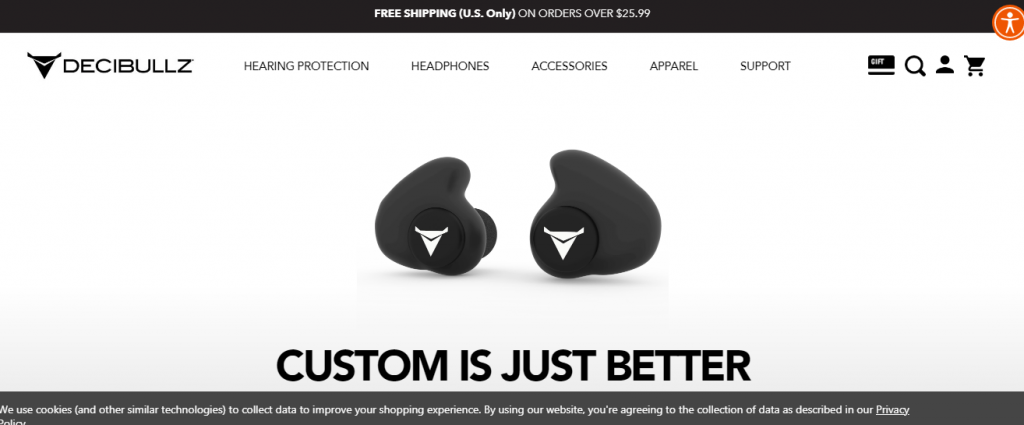
Design is monochrome, which allows promoting the main idea while also being inclusive and clear to people with vision issues.
Conclusion
Thus, every business and every company needs to be on the Internet. However, to be present successfully and be attractive to customers, the business needs a creatively designed website with easy navigation, a smooth and quick checkout process, and a variety of other details that are evident to professionals. While BigCommerce provides the platform for the quick development of the online store, having a professional hand and eye in crafting the navigation, structure, and even design might be crucial to the success of your project. SOFTLOFT company has got various experience with BigCommerce and is one of the top eCommerce software development companies that work with BigCommerce to create online stores that sell big.
Don’t wait any longer, just contact us for more specific information about your project.


